Conditional Formatting in Power BI allows users to dynamically change the appearance of visuals based on specific rules, values, or conditions. It enhances report readability, draws attention to key insights, and enables better decision-making.

Understanding Conditional Formatting in Power BI
Definition and Purpose of Conditional Formatting
Conditional Formatting is a feature in Power BI that dynamically adjusts the appearance of visuals, such as colors, icons, and data bars, based on predefined rules, values, or calculated measures.
Benefits of Conditional Formatting
| Benefit | Description |
| Enhanced Insights | Highlights important trends and exceptions. |
| Improved Clarity | Makes data patterns more visible. |
| Dynamic Visuals | Adapts visuals based on real-time data changes. |
| Cost-Efficient | Optimizes data processing costs in the cloud. |
Common Use Cases for Conditional Formatting
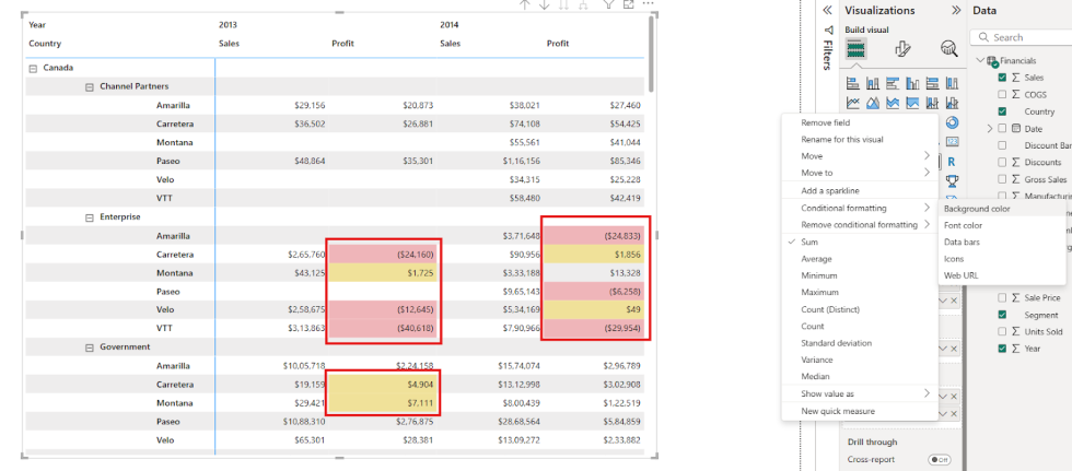
- Sales Metrics: Highlight sales exceeding targets with yellow and underperforming sales with red.
- KPI Dashboards: Show performance trends using icons (e.g., up/down arrows).
- Financial Reports: Highlight negative profits in red and positive profits in yellow.
- Heat Maps: Represent high and low values using gradient colors.
Configuring Conditional Formatting in Power BI Desktop
Step 1: Select a Visual and Field
- Create or select a visual (e.g., Table, Matrix).
- Identify the field you want to apply conditional formatting to.

Step 2: Open Conditional Formatting Menu
- Go to the Values section in the Visualizations Pane.
- Expand the More Options (V) next to the field.
Select Conditional Formatting > Background Color (or Font Color, Data Bars, Icons, etc.).

Step 3: Apply Rules or Field-Based Formatting
Option 1: By Rules
- Choose Format by > Rules.
- Set conditions (e.g., if value <= 10K, then colour is Yellow, negative value in profit then Red).
Click OK to apply

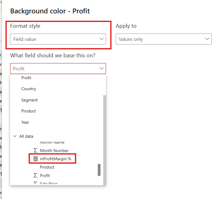
Option 2: By Field Value
- Choose Format by > Field Value.
- Select a measure or calculated column that defines formatting logic.
Step 4: Use Icons for Conditional Formatting
- Choose Conditional Formatting > Icons.
- Select a Style (e.g., arrows, flags, shapes).
- Set rules for each icon based on thresholds.

Step 5: Validate and Adjust Formatting
- Ensure the formatting highlights the intended insights.
- Adjust rules or colors if necessary.
Advanced Techniques for Conditional Formatting
- Using DAX for Dynamic Formatting: Create custom measures for advanced conditional rules.
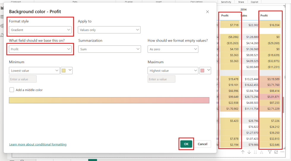
- Gradient-Based Coloring: Apply gradients for smoother transitions in heatmaps.
- Cross-Visual Formatting: Use conditional formatting across multiple visuals.
Best Practices for Conditional Formatting
- Avoid excessive use of colors to prevent visual clutter.
- Use meaningful colors (e.g., green for success, red for issues).
- Test on different data scenarios to ensure consistency.
- Keep formatting aligned with business logic.
Key Limitations of Conditional Formatting
- Limited to specific visuals (e.g., Matrix, Table).
- Cannot directly format Pie Charts or Line Charts.
- Complex DAX measures may slow down performance.
- Overusing conditional formatting can reduce report clarity.

Author: Deepali Tiwari
Deepali Tiwari is a skilled Full Stack BI Developer with 3 years of experience in designing and enhancing business intelligence solutions. At Orange Data Tech, she leverages her expertise in both front-end and back-end technologies to develop intuitive, data-driven applications that help businesses make informed decisions. With a strong foundation in BI tools, data modeling, and analytics, Deepali is committed to delivering high-performance solutions that drive operational efficiency and strategic growth.